

Designing between the pieces!
If you’ve been following along on Instagram this summer, you’ll have noticed that I’ve been participating in the 2019 Summer Sampler.


I LOVE this sampler, and this is the third year I’ve done it. My 2016 sampler is one of the quilts I reach for most, and we won’t talk about how my 2018 sampler still isn’t finished! It’s definitely on my to-do list this fall :) This year, I pulled a bunch of stash fabrics to coordinate with some floral print I wanted to use up, and I’m loving the vintage sheet vibe that’s coming through!

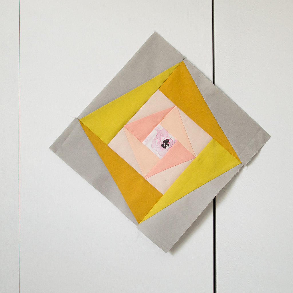
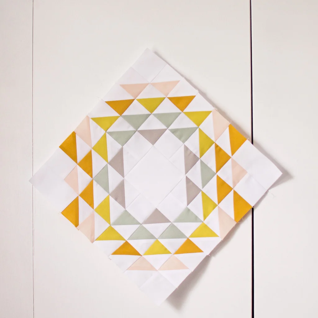
I’ve gotten a lot of questions about what I’m using, so from the top, I have Indy Bloom Designs Corsage Floral in Peachy Plum (from Hawthorne Supply Co!), and then Kona White, Ice Peach, Peach, Curry, Wasabi, Seafoam, and Ash. Various combinations of these colors have been popping up in a lot of my quilts lately, and I love how versatile each individual solid in this quilt is.
HOWEVER. What I really want to talk about today is the most exciting piece (do you see it hanging out in the last spot of the grid above?) - I designed this week’s block! Unlike the rest of the blocks with the “Piecing Bootcamp” theme, mine is less about new and innovative piecing techniques and more about color placement, design theory, and thinking about how blocks can be reimagined without changing the underlying construction. And with no further ado, I present, Circle Gets the Square!
Conceptually, it’s not a difficult block. It’s 16 drunkard’s path quarter circles- nothing fancy! To be honest, you could do this as four inset circles or eight half-circles and save yourself a lot of cutting and piecing, and being a seam minimalist, that would be my first thought as a designer. No need to cut apart a bunch of the same fabric and sew it back to itself, right?
But what I love about this block is how much versatility all those extra seams add, and the opportunity it provides to think “between” the blocks,.
The simplest color option is one color per circle (or for all of them) and one color for the background, and that would be a perfectly excellent choice.

However, with the way this block is constructed, each circle actually has four corners. We can accentuate that by adding one additional circle color.
Just by changing the color of a single quadrant in each circle, we’ve added another dimension to the block. Now, a square emerges from the circles, and all of the circles are interacting with each other instead of functioning as four separate units. The second design feels like a more cohesive, intentional design to me than the first. We can push this idea a little further and start mucking around with the background fabrics too, which gives us some equally cool designs.
We can change the focus of the block by using the background color for one quadrant and a different color for the middle background pieces, which gives a plus shape.
We can start to add depth by emphasizing the invisible middle square. Extending the white into the circles makes the square float above the circles.
We can add another layer of depth by extending the white into some of the circles and keeping others on top. Now there are three layers of depth in the block.
We haven’t changed anything about the underlying construction- it’s still 16 drunkard’s path blocks. But by thinking about how those drunkard’s path blocks interact with and influence each other, we’ve been able to create five completely different blocks just with color placement.
As you’re working on this week’s block, I encourage you to play around a bit and see what cool variations you can come up with! And once you start adding prints into the mix, the possibilities are endless.
Stay tuned for another blog post soon that explores this concept a little further! I’ll show you how I’ve incorporated these exact concepts into two quilts featuring one of my favorite piecing motifs- the Sawtooth Star!


